
Wednesday, November 30, 2016
Winter Trees
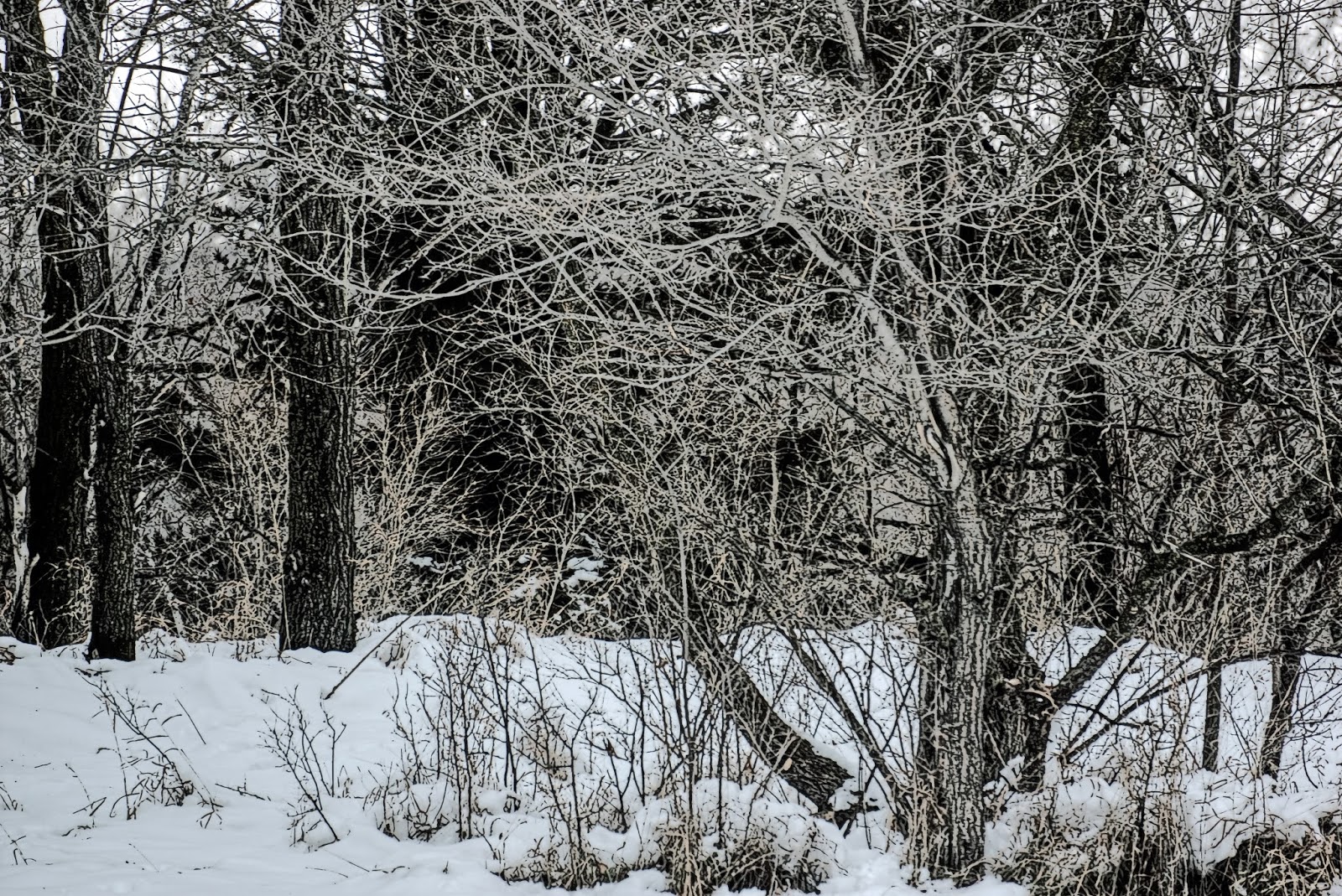
Technically, these are late autumn trees, but if I called them that, you might expect pretty leaves (which have long ago blown away.) The danger in calling them winter trees is that you might expect to see snow, or frosted branches, which... aren't there, either. In the end, I opted for winter, because the expectation for seeing snow doesn't offer much of a comparison next to the disappointment of not seeing any colorful leaves. Thanks for stopping by!

Tuesday, November 29, 2016
A Tree of a Different Color
Evergreen trees are nice because they are always green, even in winter. Although, I have seen some evergreen trees that were orange. However, I was told that those weren't evergreen trees. Thanks for stopping by!


Monday, November 28, 2016
Series: Dark Trees (3 of 3)
For this third image in the series, my subject tree has been shifted over to the right vertical third of the image. The snow still remains the bottom horizontal third, and there is something of a skyline visible through the trees that forms the upper horizontal third. Again, I think my favorite image in the three posted today is the black and white stamp filter (the second image below), because of the way that the branches have turned white while the tree trunk is dark. (It reminds me very much of a "negative" image.) Thanks for stopping by!


Sunday, November 27, 2016
Series: Dark Trees (2 of 3)
This image has been re-positioned in comparison to yesterday's image. The rule of thirds can still be seen in this image, with the snow still forming a first horizontal third along the bottom, and the tree on the left forming a vertical third on the image. Again, I like the black and white stamp filtered image, which has picked up the dark parts of the original in the tree trunks, while many of the branches appear white in the image. Thanks for stopping by!


Saturday, November 26, 2016
Series: Dark Trees (1 of 3)
Today's images are the first in a three part series of dark trees. Actually, it'll be the same tree, but the position of the tree will be slightly different. In today's image, it's a straight up rule of thirds framing, with the bottom horizontal third of the image being the snowy foreground, the left vertical third roughly lining up with the subject tree. What I found wanting in this image was that I wanted to see more of the tree; it felt to me like the tree was missing, or at least, most of it. Maybe that's because I know what the rest of the scene looks like.

The black and white stamp filtered version, like the original on which it was based, came out dark, although the middle layer of snow might stand out a little bit more in this image than in the previous one.

My final editing attempt added the color back into the image. This may have helped to lighten a very dark image up, but I think that I might like the darker version better.

Thanks for stopping by!
Friday, November 25, 2016
Snow under the Evergreen
This is one where I like my black and white stamp filter edited version the best of all.
HDR and snow typically do not go together. The high dynamic range that is brought out in these images treats the snow as though it is hiding something (it is!) and finds all of the possible darkness that is lurking in the snow, so that when you process an image of snow in HDR, it usually comes out looking rather dirty.

I take the HDR image, however, and use it for my stamp filtering process, because the HDR seems to help the stamp filter catch more of the details than are caught in the same image without the HDR. (At least, that's what I've observed in other comparisons that I have made when processing a stamp filtered image.) What I like about this image is the prominence of the tree trunk as the main focus of the image. It doesn't get lost in the background, even if its various branches and needles do. I also like how the snow came out white again, except for the grassy parts that had been poking through.

I also then merge (layer) the colored image back into the stamp filtered image, usually at somewhere between 60-70% opacity, so that the lines of the stamp filter give definition (kind of like outlining the edges) of the colored image. The color is diminished, but usually there is enough of it to give a comic book-style feeling to the image. While the image below is ok, and I like it just about as well as the original HDR image, my favorite for today is the black and white stamp filtered version above.

Thanks for stopping by!
Thursday, November 24, 2016
No Snow... Snow
I had to chuckle because these two pictures appeared one right after the other on my camera, even though I had taken them two weeks apart. Yep, the snow came just about that quickly!


Thanks for stopping by!


Thanks for stopping by!
Wednesday, November 23, 2016
Scrambled Brush
I like forest images where the tree branches all jumble and scramble together. It makes for a very busy stamp filtered image (the second image, below), but then also, when you add the color back in, there are all sorts of lines (outlines) appear in the image. Of the three that I'm posting today, my favorite is the top (HDR with Photomatix). Thanks for stopping by!


Tuesday, November 22, 2016
Pink(ish) Flower

I'm not actually sure what color this flower is. It's sort of a pinkish, reddish, maybe even slightly purplish color. (And it's this color after the HDR program works its processing.) In real life, the flower was not so vibrant. It was probably even a little bit past its prime. Here... it's looking pretty good, especially when compared with the colorless, white blanket of snow on the ground outside of my window. Thanks for stopping by!
Monday, November 21, 2016
Deer at Sunset

I was trying to think of what I would call this photo. "Do you see what I see?" or something clever like that. Well, as I got to putting together my labels, I had "deer" and "sunset", from which I drew my less clever title: "Deer at Sunset". If I had wanted to go even further, I could have tagged the trees and said, "Deer with Trees at Sunset." But, it's not really the best tree photo. Now that I mention it, it's not the best deer photo, either, nor really the best sunset photo. I like the color of the clouds, though.
Thanks for stopping by! :)
Sunday, November 20, 2016
Fiery Sky (Dry Brush Filter)

It's been a little while since I've added a Dry Brush filter photo (at least, it feels like it's been a little while since I've added a dry brush filter photo,) so here we go. I usually use the dry brush filter when there is something 'off' in my image, either noise (or sometimes focus), but I still want to redeem the image. What I especially liked about this image was the play of the fading sunlight on the clouds, making it look as though... the sky were on fire. That's today's image; thanks for stopping by!
Saturday, November 19, 2016
Goldfinch at the Feeder

As winter sets in, I'm going to need to be a little bit more diligent about paying attention to my bird feeder. Thanks for stopping by!
Friday, November 18, 2016
Mourning Dove Looking into the Grass (Stamp Filter)


Looking at our first major snowfall of the year, I thought I would look back to a slightly gentler time of the year, when the birds were out in the grass looking for bugs. (That is one advantage of these colder times of the year; you don't seem to see nearly as many bugs.)
Thanks for stopping by!
Thursday, November 17, 2016
Three Passes on a Field with Deer
Admittedly, it's not the best "field with deer" picture. What I thought interesting was the different effects that you could get when processing an HDR image. The top image is practically bright and cheery, whereas the clouds in the middle image look slightly menacing. The third image is the best of both worlds, where I took the top two and layered them together. Thanks for stopping by!


Wednesday, November 16, 2016
Stamp Filtered Mackinac Bridge and Mackinaw City Water Tower

Back in grade school, I remember an art project where we had these really sharp gouging tools that we used to gouge away parts from a flat rubber piece, making a stamp. (I'm pretty sure that I nicked myself a few times in the process.) I've also heard of something similar being done with potatoes. Back in the era of the fifteen hundreds (give or take a century or two,) the process of making woodcuts was very popular, with some of those woodcuts having not only very fine details, but also the artist had figured out how to create layers of shading to increase the color palette from black and white to quite a bit of gray in between. The above image was neither cut into a rubberized mat, nor a potato, nor a piece of wood; I can't imagine the patience that it would take go through and get even the larger details in this photo, not to mention all of the ripples in the water or the wall of rocks that runs directly through the middle of the image. So, here's a shout out to Albrecht Duerer; good job! :)
Thanks for stopping by!
Tuesday, November 15, 2016
Colorful Tree in the Fall

Fall color photos are some of my favorites, catching a variety of colors (such as the reds, oranges, and yellows) in the trees. Unfortunately, with winter soon upon us, the color palette outside will go from fall colors to white... and brown (but not sepia.)
Thanks for stopping by!
Monday, November 14, 2016
A River Runs Through It

A river runs through this forested area, past these trees. I like the wall of rock with all of its roots and even a tree or two growing out of it. Thanks for stopping by!
Sunday, November 13, 2016
HDR Comparison from Two Different Programs -- Photomatix and DxO Optics
This is the non-HDR edited version:

This is the DxO Optics HDR image:

This is the Photomatix HDR image:

Comparing the results from HDR programs is a little bit like comparing apples and oranges, because the results will vary based on 1) the capabilities of the program to manipulate the image and 2) the abilities of the user to make full use of the capabilities of the program. I am not an expert in either Photomatix nor DxO optics, by anyone's stretch of the imagination. I am more comfortable moving the slider buttons on Photomatix, and I haven't exactly yet found the slider buttons on DxO. The DxO Optics Pro 8 came with three HDR presets, two of which can only be used with a RAW image file. Photomatix comes with all sorts of presets, which gives you roughly dozen a more preset HDR options when processing your image. Besides this, Photomatix has a slider panel that you can use to make adjustments in order to fine-tune your image. So, I offer in this post three images -- the sort of original base image, the DxO HDR, and my Photomatix HDR. Thanks for stopping by!
Saturday, November 12, 2016
Ocqueoc Falls in HDR
I'm at a little bit of a loss for what to say about these photos. My favorites are the two colored versions, giving a slight edge to the HDR (photo number one) over the colorized stamp filtered photo (number three). The black and white stamp filtered photo is extremely busy, with the various elements of the picture blending together to the point where it is hard to identify - here's the rocky bank, here's the river, there's the forested growth on the other side. The river especially disappears in the bw image, whereas, the color in the color images helps to separate out the different parts of the image. While I generally like the definition that I find in the colorized stamp filtered images, the layering takes out some of the color (usually 30-40% in my images.) So, the winner this week (in my book) is image number one - Ocqueoc Falls in HDR. Thanks for stopping by!


Friday, November 11, 2016
A Patchwork Lawn of Leaves
When I began processing this image, all of the intermingled colors of the leaves on the ground reminded me of a patchwork quilt. I like how you can see all of the line details in the black and white stamp filtered version below. The third image is a colorization of the second, layering in the first. Thanks for stopping by!


Thursday, November 10, 2016
Fall Colors -- Warm vs. Cold
It was only within the past year or so that I became aware of the idea of warmer and cooler images. As I understand it, colder images seem to lean a little toward the blue end of the spectrum, while warmer images lean a little more toward the orange end of the spectrum. Using the camera, the tint can be achieved by adjusting the white balance. In post-processing, well, I suppose that has something to do with adjusting the white balance there as well.
In the two examples of the same image below, the first is what I consider to be a 'cooler' image, the second 'warmer'. When I run through applying the preset image adjustments from Photoshop to my images, I notice that the colors tend to go from warmer to cooler when I run the 'adjust color' preset. (I actually think I prefer warmer images better.)


Thanks for stopping by!
Wednesday, November 9, 2016
More Fall Colors
Slightly edited original

Photomatix HDR version

Black and white stamp filtered version of the HDR

Colorized Stamp Filtered Version

Tuesday, November 8, 2016
Fall Color Trees: To Tonemap or Not to Tonemap
I had the chance to get some really nice fall color pictures this year. For today's image, I give you a before and after, an HDR edited image and one without the HDR editing.

The first is the non-HDR image. The trees are natural and yet colorful.

The second image is the HDR version. The color is... accelerated to a new level. There is something to this image that doesn't seem real, almost as though it were some kind of painting instead of a photograph.
So, to the question: Which is better? The tonemapped HDR version, or the one without?
Thanks for stopping by!
Subscribe to:
Comments (Atom)